


The story of Trafikkalfabetet
 This typeface was created at Vegdirektoratet (norwegian road council) ca 1965 by Karl Petter Sandbæk - project manager was Karsten Krogsæter. The typeface is used for all road signage in Norway, and until 2002 also for norwegian license plates. Trafikkalfabetet looks a lot like the german DIN Mittelschrift, but has some special details of its own - perhaps inspired by the british road signage?
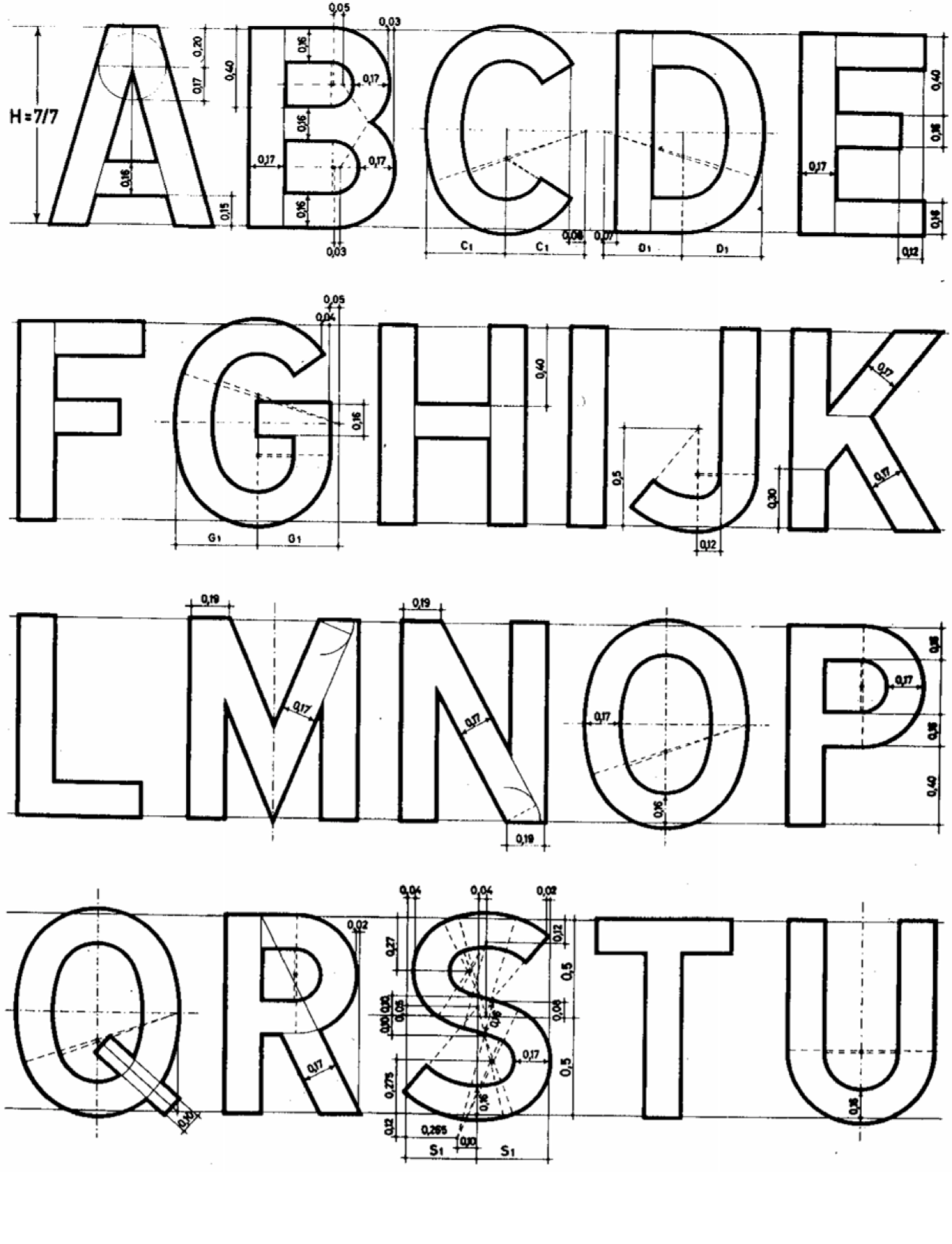
In the beginning Trafikkalfabetet only existed as technical construction drawings, but it was for some time included/embedded in the foil cutters of Vegdirektoratet. In time more and more external companies were used to make signage locally, but the unavailability of Trafikkalfabetet in digital form unfortunately led to alternative fonts being used. There was a great demand for a digitized version of the typeface.
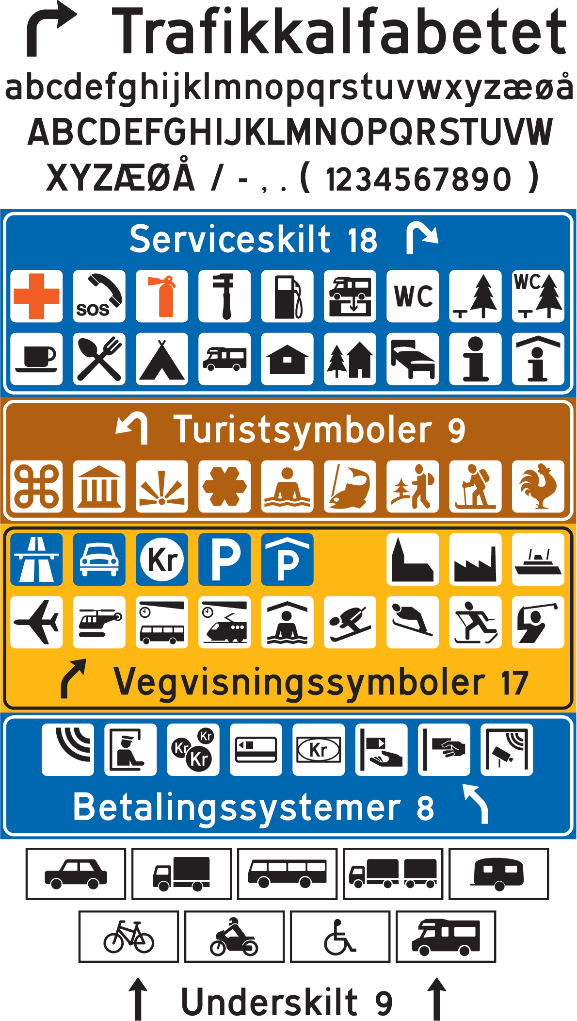 The summer of 2006 Jacob Øvergaard came over the old construction drawings for Trafikkalfabetet, and started to digitize the typeface. The digitization was completely true to the technical drawings and descriptions - including typographic weaknesses - and was limited to only 77 glyphs. The time coincided with a signage reform, so he also digitized all the standard symbols that might be used together with Trafikkalfabetet on roadsigns.
For many years the digital Trafikkalfabetet has been a great help for all those making road signage in Norway, but some shortcomings still made problems. The original drawings did not contain any accents, so if signs for places like "Grünerløkka" or "Bygdøy Allé" were to be made the accents had to be taken from other typefaces - again with varying (and inconsequent) results. Also when making signs in the native Saami languages other makeshift solutions had to be employed.
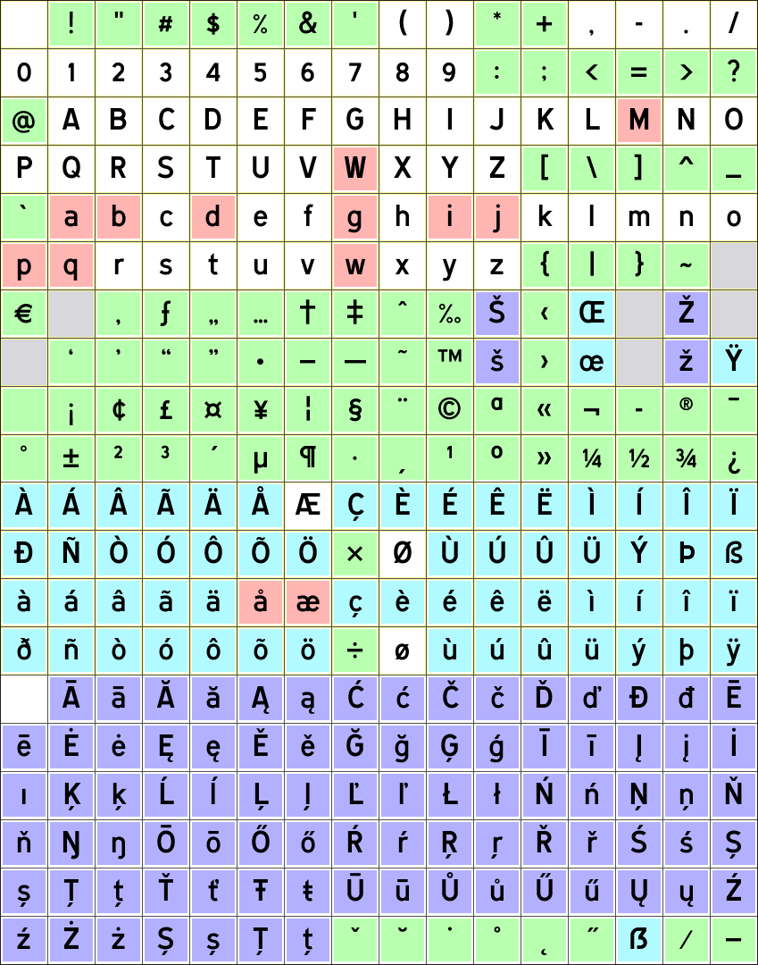 So in 2014 Jacob Øvergaard released "Trafikkalfabetet Pro" - complete with all the missing basic glyphs, all west- and east-european accented letters (also saami) and adjusted kerning. At the same time he took the opportunity to correct some typographic "errors" in the typeface: the too small dots above i/j, the tight transitions between stems and bowls in a/b/d/g/p/q and the optically darker w/W. Just minor adjustments. Trafikkalfabetet Pro - with 313 glyphs - is now ready for all kinds of use in the coming years!
Purchase Trafikkalfabetet
Should you wish to use Trafikkalfabetet as a font (if you are a professional making real roadsigns for Vegdirektoratet, a designer who recognise a classic typeface, a typography enthusiast or...) you can easily license and download the font directly from this website.
The file you can download after paying through PayPal contains the new and improved "Trafikkalfabetet Pro", together with the previous version "TrafikkAlfabetet" (in case you want to use the typeface authentically and complete with its original faults) and the pi font "TrafikkSymboler" (with a user manual). All fonts are in both OpenType and TrueType format.
Jacopyright © 2014-2022. All rights reserved.